Skyjetz Airline
Final project as part of university certification degree, done with the Glasgow Caledonian University at the UX Design Institute.

Client
UX Design Institute
Date
2022 - 2023
Collaborators
Solo project
Project type
UX research, design and prototyping
Role
UX Researcher / Product Designer
Activities
Market research, User research, Analysis diagrams, sketching, wireframing, prototyping, User interviews.
Project overview
Context
For this project the fictional client is a start-up airline. They’re looking to create an online experience that is fast, easy and intuitive: one that’s based on a deep understanding of their target users.
Task
The task was to design a new website for this client, focusing specifically on the flight booking process: how users search for and select flights online, add options and pay.
The scope of this project was to go through the full UX design process.
The end goal is to design and build a clickable medium fidelity prototype that can be tested with users, along with a detailed set of annotated wireframes.
Research
To gain a deep understanding of users' goals, behavior, and context, I focused on three research methods:
Competitive benchmarking, to gather insights from best in class airline on what they do and what they have in common to identify patterns and good practices, and identify what they do not so good that I could improve.
Online survey to gather both quantitative and qualitative valuable data
User testing and depth interviews, to dive deeper into airline user's goals, behavior, context, extract their pain point and see how they approach flight booking on major airline.
Competitive benchmarking
In order for me to better understand the usability of airline apps, I reviewed and compared the usability of four popular websites. Airlines that I used for this research task were EasyJet, Ryanair, Norwegian and Etihad. The objectives of this project were to:
-
Learn how best-in-class websites and apps solve the problems we are trying to solve.
-
Understand the conventions we should follow.
-
Highlight best practice that we should emulate.
I picked 3 major airlines: Airfrance, Aircanada, Norwegian and a wild card: Google flights and I focus my benchmark on 3 areas: homepage, Search and select flights and Entering details and payment.

Take away: A bunch of good practices and conventions that are anchored to most user's mental model.
Online survey
Next I conducted an online survey to better understand users behaviours, needs and goals. Gathering quantitive and qualitive data allowed me to determine:
-
The goals of people that use airline websites and apps.
-
What users are trying to achieve during their browsing sessions.
-
How do they manage multi travellers booking and sharing
-
If there are any pain points for users.
-
How users are browsing airline pages.
-
How do they generally feel about flight booking.
Exctract from key finding
Take away: One of the most important and surprising take away was that the vast majority of respondants prefer using a computer to book flights, due to the added confort a bigger screen proccurs. This helped my decision to focus primarily on the desktop app for this project.
User testing
In the case of building the Skyjetz website from scratch, competitor websites were tested to gather insights. I conducted 3 usability tests on EasyJet and Norwegian, as they represented the target market for Skyjetz. Additionally, I took part on two other usability tests that were conducted earlier, focusing on Aer Lingus and Eurowings, from these I took extensive and detailed notes (Recording review). Overall, three participants took part in the testing, and four airlines were examined.
During the usability tests, I observed how users interacted with the websites and noted their mental models, behavior, and pain points related to the booking process. To gather further insights, participants underwent in-depth interviews before the tests, allowing me to understand their goals, previous booking experiences, and any common pain points they encountered.
Key Findings and insights:
-
Many websites present excessive and unnecessary information, leading to information overload for users.
-
Certain features on the websites can be confusing, lacking proper explanations.
-
Users are unsure whether the displayed cost is for one passenger or multiple passengers.
-
The booking process is complex and difficult to follow.
This part consisted of 2 pre-recorded user testing, which I had to listen to, to exctract ideas and findings, I compiled a bunch of notes. And 3 user testing conducted by myself, 2 done entirely remotly using zoom and 1 done in presencial.

Screenshot from Daniel's user testing and depth interview

Notes from user testing and depth interviews #1

Screenshot from Daniel's user testing and depth interview
Example of notes taken from user testing
User testing Daniel
User testing Jenni
Take away: As usual, user testing is the most powerful research method, the amount of info gathered from this is rich and generous.
Analysis
Affinity diagram
To proceed further and structure the data collected during the research stage (competitive benchmarking, online surveys, and usability tests), I needed to use triangulation method to highlight patterns and since a significant portion of this data comprised qualitative information, I sought an organized approach, leading me to employ an affinity diagram. Firstly, I jotted down essential findings and observations on individual post-it notes and subsequently sorted them into relevant groups.
Initially, I categorized the data into distinct sections including search form, search results, Flight Selection, upsell, Checkout etc.... Next, I conducted a deeper analysis within each group, creating smaller subgroups that focused on specific components like the date picker or flight card. This process helped identify patterns and pinpoint areas that needed improvement. As a result, organizing these primary categories in a sequential order based on their position in the booking flow proved advantageous when developing a customer journey map.
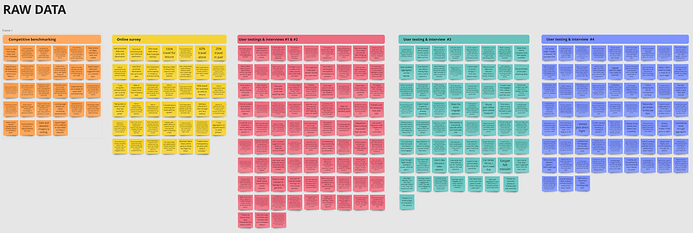


Checkout the complete affinty diagram including the raw data.
Final diagram overview
Take away: The most painful area in the flight booking process happens on the search result page and selecting flights. The upsell section is seen by most as unecessary and annoying.
Customer Journey Map
Once all the research data was organised, I carefully examined each step of the user's journey throughout the booking process to assess areas where Skyjetz could enhance the experience. At each stage, I delved into the users' goals, behaviors, positive aspects, and pain points within the process. To gain further insights, I incorporated quotes from the usability tests.
This analysis revealed that users encountered difficulties with various aspects of the website. However, it was particularly evident that the "search results, selecting flights and upsell" segment posed the most significant challenges for users. Consequently, it became clear that this area should be the primary focus when designing Skyjetz.

Take away: The customer journey map confirms the most painful area in the flight booking process happens on the search result page and selecting flights. The upsell is also a problematic area, often perceived as unecessary.
Concept Design
Flow Diagram
Moving on to the design stage, the first step involved mapping out the user's journey through the website, starting from the homepage and concluding at the checkout stage. Throughout this process, my aim was to create a streamlined flow that prioritized simplicity while addressing the pain points identified in previous projects.


View the Booking flow diagram
Take away: The flow diagram is linear, abd if done properly the user should navugate through it without hiccups.
Interactive designs - sketches
From the user flow above, I started sketching each step of the booking flow experience taking in consideration the key findings during the Research and Analysis phase. They address as closely as possible the goals, behaviours, pain points defined in the customer journey map. They also integrate common pattern and mental models users are used to globally.
This creation process was iterative. The final sketches are shown below:


Take away: There's nothing better than pencil and paper to ideate.
Design: Wireframes & Prototyping
Prototype
The next stage of the process was prototyping. i first made sure the full flow was covered by the sketches and all necessary interactions were designed and documented. I decided to go with a medium/high fidelity prototype, as these prototypes have the ability to convey richer interactions from the user and gain greater data and insights.
Once I had done a first iteration of the prototype, I asked a few users to test it out, to iterate and refine the designs and interactions. The final prototype is the result of a few round of testing / improvements.


Take away: User testing is crucial at this stage. Taking a lean approach to the work, testing smaller and often was more efficient to get there.
Annotated Wireframes (Mockups) & Handover
Finally, I produce high quality annotated wireframes as part of handover documentation for developers, and in some situations, UI designers too (We'd assume for this project that there is a UI system in place).
All pages, components, screen states, error messages, copy and interactions are explained and detailed to avoid any guess work from the engineering team:


Overall take away
It had been a while since I was able to work on a project where I follow a rigorous research & design process, and I enjoyed every stages of it along the way. That said, I am aware that in a professional environment, depending on budget and schedule, this can be very different, adaptability is the key and compromises would always have to be made, this creates unique and enjoyable challenges too.